Difference between revisions of "WE Protect Freedom!/Branding development"
| Line 359: | Line 359: | ||
* [[FOEPATCHISM]] | * [[FOEPATCHISM]] | ||
* [[Meaningful liberty]] | * [[Meaningful liberty]] | ||
| + | * [[Prepping]] | ||
* [[South-Western Ontario calendar and newsletter]] | * [[South-Western Ontario calendar and newsletter]] | ||
| + | * [[Technology alternatives]] | ||
* [[WEFringe group email lists]] | * [[WEFringe group email lists]] | ||
* [[WE Protect Freedom!]] | * [[WE Protect Freedom!]] | ||
| Line 370: | Line 372: | ||
| + | [[Category:Awareness]] | ||
[[Category:Brainstorming]] | [[Category:Brainstorming]] | ||
[[Category:Branding]] | [[Category:Branding]] | ||
| + | [[Category:Communities]] | ||
| + | [[Category:Community]] | ||
[[Category:Essex County, Ontario]] | [[Category:Essex County, Ontario]] | ||
[[Category:Freedom]] | [[Category:Freedom]] | ||
[[Category:Funding]] | [[Category:Funding]] | ||
| + | [[Category:Information]] | ||
[[Category:Organizing]] | [[Category:Organizing]] | ||
| + | [[Category:Outreach]] | ||
[[Category:Protect Freedom]] | [[Category:Protect Freedom]] | ||
| + | [[Category:Public relations]] | ||
[[Category:Resistance]] | [[Category:Resistance]] | ||
[[Category:WE Protect Freedom!]] | [[Category:WE Protect Freedom!]] | ||
Revision as of 13:05, 23 August 2023
- < WE Protect Freedom!
- This page is a work in progress. Feel free to join to help edit Projex.Wiki. Check back for developments.

WE Protect Freedom! may be a comprehensive way to organize, clarify fundamentals, positively rebrand ourselves, engage our members, better grow our numbers, and visibly and/or financially support our freedom groups.
Recognize it or not, strong branding is critical in our modern age - especially when attempting to counter the corporatocracy's avalanche of brainwashing, distraction, division, deception, manipulation, and propaganda.
The name or title, "WE Protect Freedom!", is not written in stone nor printed on cards, yet, so this name, title, and these Branding developments may come to nothing and be abandoned - or may remain, evolve, and/or thrive. Time will tell.
- See also
- Wikipedia: Brand
- Wikipedia: Brand management
- Wikipedia: Lifestyle brand
- Wikipedia: Marketing
- Wikipedia: Promotion (marketing)
- Wikipedia: Visual brand language
First draft
This is just an evolving first draft pitch by Jason Carswell that will be presented to our communities for consideration, further input, development, improvements, tweaking, and hopefully for wider acceptance and implementation. This living document may evolve and change over time, yet it includes an immutable history of revisions ("view history" at the top of every wiki page).
Naturally and always, everyone is welcome to a Projex.Wiki account to edit and contribute to these wiki pages (we'll soon host wiki classes), or you may interact via email, phone, or in person with Jason or others who will improve these wiki pages with your contributions.
Hopefully this developmental process on these WE Protect Freedom! and Branding developments wiki pages will yield a cornerstone constitution (with room for amendments), powerful branding, and our community strengthened by distributed management, open organizing, improved communications, insightful analysis, preparation for sustainable growth, and greater fortifications against tyranny.
Why rebrand and reorganize?
- Since we're running out of business cards, we'll need more.
- Since we're designing and printing cards, why not also flyers, web resources, T-shirts, and other merchandise to raise funds for projects and/or rainy days?
- Since many folks were exceptionally disappointed with the first business cards, why not redesign and improve them - and include the community in the process?
- lack of inclusiveness for community involvement, feedback, and adjustments
- missing critical information and links
- poor branding, poor design, and poor messaging
- rushed job
- stuck with unprofessional cards for a year
- Since we're not yet in desperate need, thus not in a rush, we may openly and collaboratively improve the card design.
- Since we're improving the design, we may improve our message.
- Since we're improving our message, we may improve our branding. This may or may not include our chosen title. Perhaps we can do better than "WE Protect Freedom!"?
- Since we're improving our branding and message, we need to understanding our core principles.
- To understand our core principles we need to define them.
- Many of us have been asking for clarity and a reference touchstone for years, whether it's a charter, mission statement, outline, whatever you want to call it in whatever form it evolves into.
These and other issues are long over due for review and collaboratively addressing and improving for the benefit of everyone.
What this not.
- This is not a mutiny.
- This is not angry.
- This is not division.
- This is not an effort to replace Stand Up Windsor, Freedom Alliance Canada, or any other existing group(s) or their functions.
- This is not an effort to change or replace any leaders, managers, organizers, project heads, or whatever.
What this might be.
Maybe nothing comes of this, or...
- Maybe we evolve, improve, organize, and grow.
- Maybe we get clarity and cards.
- Maybe we build stronger, more inclusive, open, more communicative community foundations.
- Maybe we can grow a larger base on better foundations.
- Maybe we'll be better prepared for whatever tyranny has in store for us next.
- Maybe in this process we form some specialized subgroups with overlapping members still participating in existing group(s) - as already happens with regional communities.
- Maybe these specialized subgroups can blossom and evolve lives of their own.
- Maybe we'll actually form a new separate group for some unforeseen reason(s). I'd rather maintain and improve than splinter and weaken.
Everything changes over time, yet some things may be steered with purpose. It's time we clarify our course, make roadmaps, and define our destiny.
Brand identity
In order to effectively develop our brand identity we must know what we don't want, drill down to our core purpose, outline our fundamental goals, and determine the best ways to communicate these to each other and the world. Some lists have been started outlining What we're about.
Unfocused, negative, limited
"Fuck Trudeau" flags merely state an opinion, crudely, and whether you are for or against Trudeau, the flag, and/or who brandishes it, that statement does not offer actions, purpose, nor productive solutions, while communicating nothing about freedom and prepper communities and goals. Unproven, it's been alleged that the "Fuck Trudeau" design is owned by a series of shell corporations that trace back to Justin Trudeau himself, preemptively controlling his own opposition - thus flying this flag may indirectly serve his purposes.
To be clear, this critique of the flag is not declaring that our communities accept or reject folks waving that flag. That is for our communities to discuss.
Clarity, motivation, action
The "WE" (all capitalized) of Windsor & Essex County was arrived at for the WEFringe group email lists and seemed like a catchy, clever gimmick to carry over. (Folks are welcome to disagree and express other ideas.) "WEFringe" is meant to be as clear and as short as possible for the group email title.
Fight
The "Freedom Fighters" term is not clear at all and needs improving.
- Fighting for freedom? Or fighting against freedom?
- Fighting with words? Fighting with fists? Fighting with nukes?
- Why so angry? Why fight in a peace movement?
For good branding, all confusions and negatives should be avoided, including all associations with violence and fighting.
Defend
Initially "Defend Freedom!" was an improvement that seemed good enough. However, it came up (sorry I forget who with) that "Protect Freedom!" is less adversarial. To defend implies conflict, not to mention that the American War Department was rebranded the Defense Department to improve public relations and perceptions of their industrial mass murder apparatus, whom we want no associations with.
Protect
"Protect Freedom!" remains a peaceful, positive, actionable statement of resistance and opposition to all kinds of tyranny - the mafia government puppet "leadership" as well as the status quo establishment of banksters, corporate monopolies, the ruling class and their deep state, their matrix of rigged systems of deception, manipulation, exploitation, oppression, and extermination, and all orders of authoritarian overreach, corruption, and despotism - from local to global.
Four versions
- Freedom! = universal appeal, but without action or purpose
- Protect Freedom! = more specific, active, may be a command, may be a call to action
- WE Protect Freedom! = our short local brand
- Windsor & Essex County Protects Freedom! = our extended local branding removing all confusion
All four versions may employ the same design motifs, whether those developed below or future motifs.
Globally, the first two versions may be sold world wide to raise funds for our causes, once designed and applied to merchandise. Hopefully with any luck, as open-source projects, these memetic ideas outlined below may inspire an effective world wide phenomenon with an organic life of its own.
Locally, we'll have our own two or more versions to be proud of and self-identify with.
Other regions
Other regions, groups, individuals, and identities are welcome to modify these open-source ideas.
Examples:
- Belle River Protects Freedom!
- Canadians Protect Freedom!
- Free Speech Protects Freedom!
- Leamington Protects Freedom!
- Preppers Protect Freedom!
- Voluntaryists Protect Freedom!
To raise the alarm

(photo by Ryan Pimiskern, Flickr).
Wikipedia: Monarch butterfly
WikiMedia Commons: Danaus plexippus.



WAR!!!
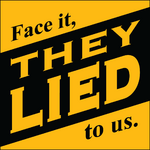
This is a war zone and we're building freedom!
Endless tyranny
During this pleasant summer of 2023, many folks may not realize that the wicked never sleep and are always orchestrating greater evils, perpetual propaganda, more lockdowns, medical tyranny, bigger psychological warfare, global institutional theft, global economic transformation, world wide starvation, and endless war - including ongoing wars on energy, families, food, health, mobility, speech, and other liberties, as well as never ending fifth generation warfare and culture wars distracting from cataclysmic collapse and economic warfare for full spectrum dominance and centralized control.
Perpetual war
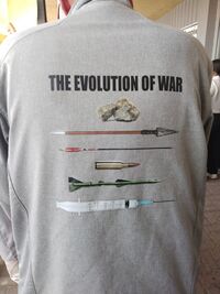
Thus our resistance work must never tire and never end, even in calm periods. Whether people realize it or not, we are in the perpetual war that George Orwell outlined in 1984. It's impossible to think of anything more alarming demanding dramatic drastic warnings to the people.
Warning tape motif
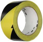
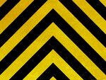
Therefore I cannot think of a more appropriate attention-getting motif than warning tape with diagonal bars of black/yellow (like honey bees or voluntaryist, anarchist, and libertarian flags, designs, and motifs). Other colours or stripe patterns may be employed, like red/white, green/white, red/yellow, or the various warning stripe colour motifs on emergency vehicles of different regions (some may have exclusive claims to colour combinations, such as UK police cars with fluorescent yellow hoods, yellow/blue checked sides, and rear yellow/orange warning chevron stripes). Easily found and purchased, the majority of warning tape comes on adhesive rolls of vinyl tape, duct tape, reflective tape, etc., cheap to expensive. (To clarify in a world of confusing labels and mislabels, by my definitions, warning tape should not be confused with caution tape, which is typically non-adhesive strung up in the air. Phrasing may repeat "caution", "biohazard", "danger", "police line do not cross", etc.)
Flourishes
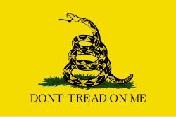
There's no reason folks can't embellish this basic foundational striped warning motif with decorative flourishes or mascot totems like honey bees, "Don't tread on me!" snakes, or lions.
Practical
Warning tape is easily available, economic, highly identifiable, and pragmatically useful to perpetuate and propagate our group identity branding motif. This bold attention-grabbing tape may be used to post up professionally printed and/or self-printed material, decorate protest signs, make costumes, or whatever inspired versatile applications arise.
Hazard signs
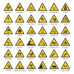
We may also embrace other yellow/black hazard signs, symbols, and motifs as well as striped mascots like the honey bee, wasp, hornet, or bumble bee.
Or orange?
Optionally we could embrace a colour shift to orange/black to be distinctly different, employ the local poisonous Monarch butterfly rather than honey bees - and embrace the Halloween aesthetic.
Communicative signaling
Warning stripes in coded colours and designs may convey messages, akin to Semaphore flags. For example, if organizers at a rally had printed clipboards, or everyone in a rally crowd or protestors had printed cards, they could communicate different concepts individually or as a group across a loud crowd by holding it up a certain way. For example, a green upward "yes" vote verses a red downward "no" vote.
(More sign language details: The four edges may each have different coloured warning stripe combinations. The clipboard or card would have two sides, 4 edges, and 4 corners providing 16 orientations (plus on end sideways) to simply hold it, with more communication options available by bobbing, flapping, waving, rotation, frequencies, speeds, patterns, etc. Sign language communications may range from simple to complex, including some basics like: "emergency", "distress", "attention", "warning", "volume up", "volume down", "repeat message", "come here", "go there", etc. The printed cards or clipboards could even list the signals. Among many distracting protest signs, specially coloured warning stripes might have a chance to stand out, even among a sea of yellow/black stripes.)
Pervasive
Ideally this freedom motif will span the globe and consciously or unconsciously trigger everyone to "Protect Freedom!" every time they see warning stripes, caution road signs, triangular hazard signs, the colour "caution yellow", orange road cones, high-visibility clothing, yellow vests, and Max Headroom.
- See also:
- Wikipedia: High-visibility clothing
- DuckDuckGo: yellow vests
- Wikipedia: Yellow vests protests
- Wikipedia: Yellow vests movement (Canada)
- Wikipedia: Voluntaryism
- Wikipedia: Anarcho-capitalism
- Wikipedia: Gadsden flag
Brand usage
Accessibility
Amateurs to professionals, anyone may apply, design, draw, make, paint, and/or purchase warning stripes to decorate for any "Protect Freedom!" design purpose.
Stripe design utility
Good graphic designers embrace pros and cons of design limitations. For example, the 45 degree diagonal warning stripes may feature energetic dynamic diagonal text, one way or the other, interactively inviting readers to tilt heads. Or each stripe may contain separate compartmentalized fields of information, alone or in a series. Prominent titles, critical information, and graphics may be overlaid without the diagonal skewing.
Core functions and goals
- Section mirrored on WE Protect Freedom!
For maximum efficacy this WE Protect Freedom! defining and branding process requires revisiting and reconsidering our freedom groups' core functions and goals, including:
- organize, engage, and network our members, groups, actions, events, and resources
- clearly communicate and openly share our fundamental values, concerns, information, and ambitions
- expand growth of members, alliances, public awareness/visibility, community abilities, and community resources
Understanding and organization of these core functions can be shared clearly outlining our mission, among members as well as the public, be printed in materials, documented online, referenced in press releases, and apply to fundraising merchandise to greater or lesser extents.
Initial brand usage ideas
This wish list may just be hopeful dreaming or only the beginning of greater things. Obvious top priority items to start with are business cards, flyers, stickers, T-shirts - and bandanas.
Bandanas
Bandanas are small and easy to distribute, easy to hide/expose, easy to wear and self-identify (like boy scouts or the original red-necks), easy to tie on something, easy to wave high, easy to use as a flag/sign, etc.
Pros and DIY
Items may be professionally produced, downloadable to be self-printed, and/or hand-made.
Store(s)?
Hopefully sooner than later, we may establish an online store and/or retail storefront to sell merchandise for fundraising (see #Support below).
Print ideas
- banners & signs
- to identify the group
- to identify the event
- to share information
- book cover designs
- for Canadian Constitution (a free download PDF e-book) to mass-print collectable hardcopies to sell
- contact book, gardening guides, health guides, herb guides, walkie-talkie manuals, etc
- business cards
- flyers
- posters
- stickers
Merchandise ideas
- 3D printed stuff
- badges-patches
- detachable Velcro badge-patches
- bags
- backpacks, messenger bags, shopping bags
- bandanas
- beverage containers
- cozies, cups, mugs, shot glasses, thermoses, water bottles
- bobble-heads
- buttons-pins
- clipboards (see #Communicative signaling above)
- Faraday cage items (printed with motif)
- bandanas, boots, caps, gloves, hats, hoodies, overalls, phone pouches
- hats
- ball caps (Team Freedom!), cowboy hats, fedoras, knit caps, sun hats
- jackets
- casual, rain shells, windbreakers, winter jackets
- shirts
- bowling shirts, hoodies, polo shirts, sweatshirts, T-shirts
- umbrellas

|
WORK IN PROGRESS! This page is under development. Check back for developments. |

|
| Feel free to join to help edit Projex.Wiki. | ||
Business card proposal
- FYI: This incomplete section requires a complete overhaul!!! Plus there are a bunch of photos of sketches to upload.
The business card would feature rounded corners (for safety) with a thicker card stock (for impact, to keep, and remember). Being a more expensive card hopefully folks will respect and revere it more. And hopefully folks will appreciate the aesthetic design.
Card front
The entire card front is yellow/black warning 45 degree stripes with red accents including the rim around the card and the title box outline.
- Large line 1:
- Windsor & Essex
- Largest line 2:
- WE Demand Freedom!
- within the white title box, outlined in red
- WE Demand Freedom!
- Large line 3:
- Societies & Networks
- "Societies" need not be government-registered groups, according to what's been said about Common Law.
- Societies & Networks
- Perhaps minimal classy flourishes would be nice, or even bracketing rampant lions (as in the unfinished painting at left by Jason Carswell).
The above will occupy the top half of the card, and the bottom half is occupied by the following...
- Within three primary black diagonal stripes are these bold sub-group titles at 45 degrees:
- Action
- Communications
- Resources
- Within yellow diagonal stripes are sub-group details in much smaller print, also at 45 degrees:
- activism, aggregation, analysis, education, information sharing, communities, families, justice, local actions, organizing, networking, protests, rallies...
- arts, communities, content creation, creative expressions, email, lo-fi alternatives, media, networking, newsletters, original productions, podcasts, social media, websites...
- communities, economics, employment, food security (distribution networks, organic farms, gardening), health & wellness, housing, networking, prepping, trade, transportation
Card back
Most of the entire card back is yellow with red text and a red edge-outline-border so that folks may use black or blue ink to make notes.
- Line 1:
- We are all under attack!
- Line 1 alternative:
- Humanity is under attack by the globalist ruling class!
- Line 2:
- We must prepare for the worst, hope for the best,
- resist tyranny as hard, as long, and as much as possible,
- and survive, thrive, and strive for dignity, respect, and compassion.
- Line 3:
- [empty space, as large as possible, for notes]
- Line 4:
- Defend against fifth generation warfare. [Hopefully this curious term will inspire folks to look it up.]
- The bottom section features a black/white QR code in each bottom corner leading to the websites listed between them:
- ◄ https://Projex.Wiki [will be linked to a more specific introductory reference page for folks with this card]
- (226)770-0055
- Info@FreedomAllianceCanada.com
- https://FreedomAllianceCanada.com ► [arrow points to the QR code]
Only a link or two more may be added to the card if absolutely necessary, but the linked Projex.Wiki page will host as many links and information as we like. Similarly, it's okay if some of the proposed text above is not on the card because all of this and so much more may be included on the Projex.Wiki introductory page that will be updated, evolve, and be improved over time. Everyone is welcome to join Projex.Wiki to help curate this page's content and so much more.
More slogan ideas
- more coming
Body copy
- more coming
